
We’ve used the library as a significant flex space. Temporary guest room that functions as both a dining area and an office… We designed the area with the understanding that when the extension was completed, the original built-ins would be preserved, but the windows would be replaced with a cased opening. Essentially, this will be our existing home’s primary entry into the extension. I opted to move the space closer to its eventual usage now that we have our designs and are moving forward with contractor interviews. The daybed was removed, and the area was opened up to expose the windows. This allowed me to better perceive the space and move the table to the middle of the room, where it has always belonged.
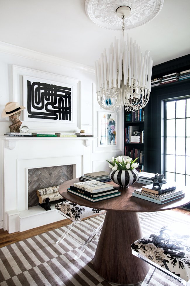
The table looked nice in the middle of the room, but the flush mount light fixture we put when this was Chloe’s room didn’t have the effect I wanted. I needed a chandelier with a lot of oomph because this would be the first thing you see when entering the addition from the deck… thus I needed something with a lot of wow factor. I had toyed with a few chandelier ideas; crystals for a more glam appearance, brass and bold felt a little too predictable, so I went back to a fixture that had captured my heart since I first saw it in a designer showroom a few years ago. The issue was that I couldn’t recall the brand or manufacturer. Isn’t it annoying when it happens? Period, one of my favorite resources, came in handy once more. I was able to browse their library of high-end things by looking up a photograph I had saved years before. Voila. The Tilda Chandelier sprang out of nowhere. I knew right away that was my wow factor.

The stunning white dipped wood chandelier was matched with my favorite ceiling medallion. This is a great example of how traditional and contemporary can coexist. I like how the light fixture has a big presence yet doesn’t take over the room. When switched on, it has texture that pops against the white walls and generates some lovely subtle shadows.

With this being a flex space, or as it is now affectionately known, the middle room… I wanted to make the table look like an entryway. Something we can comfortably walk about while also being able to bring chairs up to while hosting a dinner party. A pair of ottomans has always been my long-term ambition. My old velvet ottomans, which were just a touch too short for our table, have now been moved to our Living Room. So, after rearranging some of my existing furniture, I discovered that my acrylic x base stool, which my late father had given me as a present a few years ago, was the perfect height for me. This prompted me to try to locate the precise stool, which was very impossible due to its discontinuation. To get the matching bases, I ended up needing to buy one with different upholstery. This meant I’d have to reupholster them.
I went back to Period, which is basically my one-stop shop for all things designer, and purchased a fabric that I had been eyeing for years. Albert Hadley, one of my favorite designers, created the Schumacher Pyne Hollyhock fabric in the colorway Charcoal. In 1962, he designed the flowery chintz pattern for one of his clients’ residences. The classic design will never go out of style. I’ve used it in other houses in different hues, but I’ve always wanted to include the charcoal version into my own. The obvious decision was to reupholster the ottomans in this fabric.

The blacks, whites, greys, and subtle dark denim blue tones in the area contrast beautifully with the rest of the artwork and carpets.


I’ve also been busy stocking our library shelves with books and some of my father’s valuables. Rather than burying all of the memories, I’ve opted to make them a part of our daily life in order to honor his memory. Knowing that I can touch anything of his on a regular basis gives me peace.

It’s amazing how much more open this area feels today, especially with the new lighting. I can’t wait to see it from our new place, but for now we’ll just have to appreciate it from our current vantage point.


Recent Comments