
It’s all about balance in good design…
Considering the colors or tones of each aspect or item may make all the difference in the end effect, whether you’re repainting a home or picking your bedding.
Warm or cold tones in your home may radically transform how it feels if they are balanced or unbalanced. Undertones in wood finishes and hardware must work together to produce a dimensional and coherent aesthetic, even in designs with a neutral palette.
To add interest to our projects, we like to blend warm and cold tones, but it can be difficult to know where to begin in your own home.
In this lesson, we’ll go through our technique to blending warm and cold tones, as well as some recommendations for making the process easier.

Cool tones vs. warm tones
Before you can start balancing the tones in your space like an expert, it’s a good idea to take a step back and consider the many effects tones may have on your design.
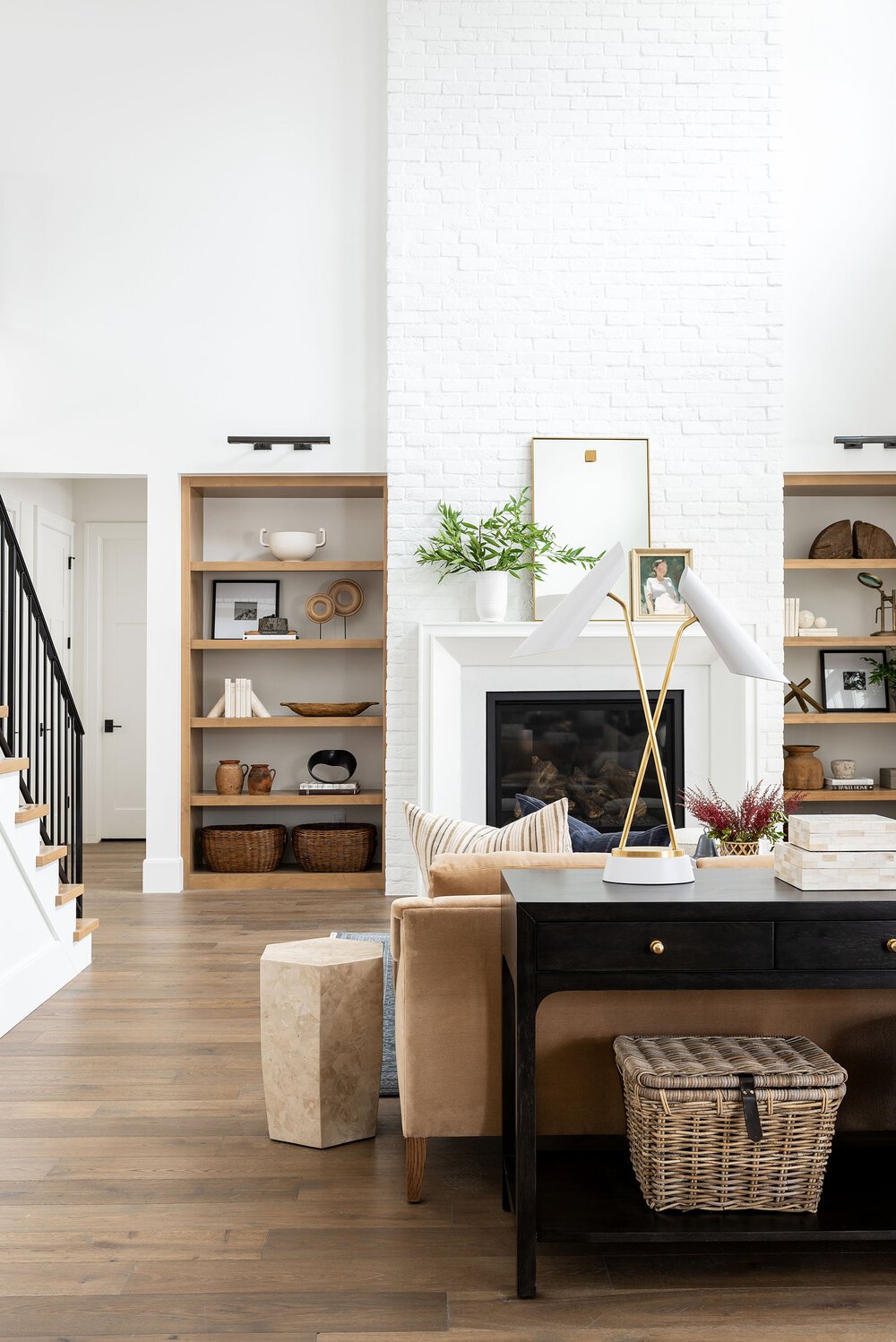
Warm tones (reds, oranges, browns, yellows, golds, beige, and whites with creamy overtones) are energising, and while they may make your home seem snug and inviting, too much of them in one location can make it feel closed-in and stuffy.
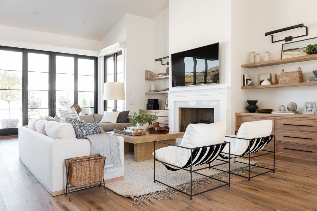
Blues, greens, purples, greys, silvers, and whites with grey undertones are relaxing and have a contemporary, clean look. Too many cool tones in one place, on the other hand, may make a design feel chilly and unwelcoming.
Whites may be either warm or chilly depending on the undertones, and because black is neither warm nor cool, it can be a terrific way to provide balance to your room.


Using a combination of warm and cold tones
Adding layers of contrast and combining warm and cold tones together is part of what makes a room feel curated and intentional, even if your space leans toward one or the other.
If you’re drawn to a specific aspect or finish, keep in mind that too much of the same thing might be overwhelming.


Identifying your starting place
Finding a starting point for blending warm and cold tones helps make the process less daunting.
Consider what you’ve previously chosen or possess, whether it’s hard surfaces like flooring and light fixtures or soft finishes like furniture and décor pieces, and analyze the tones coming through. Is it warm or cool?
It’s easy to layer and contrast to add interest after you’ve established a starting point.


Using contrasting parts to provide depth
Furniture and décor may also be used to provide contrasting tones into your finishes.
In a dark, cool-toned lounge space, leather chairs can quickly make the space feel welcoming, while cool-toned barstools in a kitchen with gold lighting and hardware can freshen and balance the space.


Are you able to spot the warm and cold features in these rooms? More examples may be found by scrolling down!


All pics credit by : McGee


Recent Comments